Want something fancy on your website? Then try using a modal. In today’s blog, I will guide you on how to create a modal with Bootstrap.
What is a modal?
A modal is a popup or dialog box that appears on top of the current page.
A Guide to Creating a Modal with Bootstrap
1. First open your HTML file, then go to the Bootstraps page and go to the modal section.
Link: https://getbootstrap.com/docs/5.2/components/modal/
2. Copy the codes under “Live demo”. Paste it to your HTML file, make some changes to the codes, and run it.
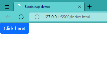
<!-- Button trigger modal -->
<button type="button" class="btn btn-primary" data-bs-toggle="modal" data-bs-target="#exampleModal">
Click here!
</button>
<!-- Modal -->
<div class="modal fade" id="exampleModal" tabindex="-1" aria-labelledby="exampleModalLabel" aria-hidden="true">
<div class="modal-dialog">
<div class="modal-content">
<div class="modal-header">
<!-- Title of the Modal -->
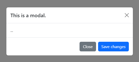
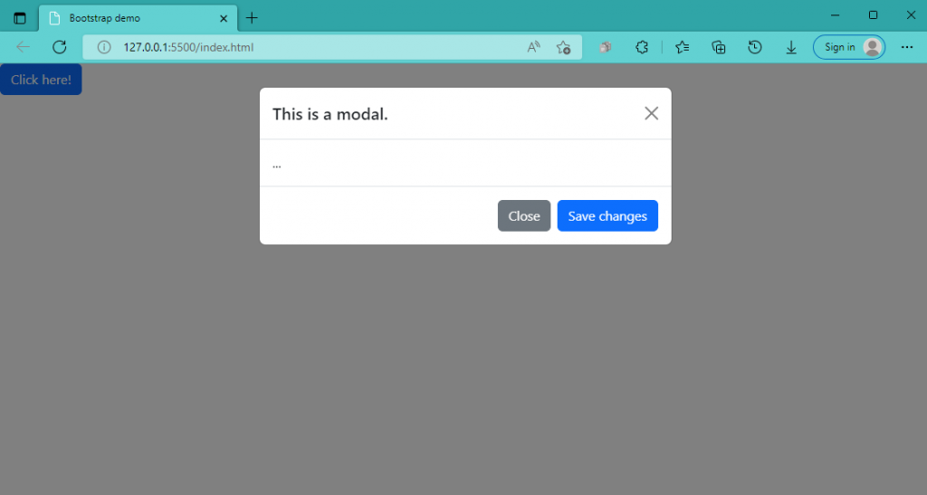
<h5 class="modal-title" id="exampleModalLabel">This is a modal.</h5>
<button type="button" class="btn-close" data-bs-dismiss="modal" aria-label="Close"></button>
</div>
<!-- Modal body -->
<div class="modal-body">
...
</div>
<div class="modal-footer">
<button type="button" class="btn btn-secondary" data-bs-dismiss="modal">Close</button>
<button type="button" class="btn btn-primary">Save changes</button>
</div>
</div>
</div>
</div>A button is what you will see at first after you run it. Then, after you click the button, the modal will pop up.
Modal size can be changed by adding some codes to the side modal-dialog. The default size of a modal is medium; “modal-xl” is for extra large, “modal-lg” for large and “modal-sm” for small. Below are examples of how the codes placed for changing the size of a modal:
<div class="modal-dialog modal-xl">...</div>
<div class="modal-dialog modal-lg">...</div>
<div class="modal-dialog modal-sm">...</div>
Modal backdrops can also be static or not. Meaning, if the backdrop of a modal is static, you can only close it using the close button. On the other hand, if it’s not, then if you click outside the modal, the modal will close.
<!-- Button trigger modal -->
<button type="button" class="btn btn-primary" data-bs-toggle="modal" data-bs-target="#staticBackdrop">
  Button for Static Backdrop Modal
</button>

<!-- Modal -->
<div class="modal fade" id="staticBackdrop" data-bs-backdrop="static" data-bs-keyboard="false" tabindex="-1" aria-labelledby="staticBackdropLabel" aria-hidden="true">
  <div class="modal-dialog">
    <div class="modal-content">
      <div class="modal-header">
        <h5 class="modal-title" id="staticBackdropLabel">Static Backdrop Modal</h5>
        <button type="button" class="btn-close" data-bs-dismiss="modal" aria-label="Close"></button>
      </div>
      <div class="modal-body">
        ...
      </div>
      <div class="modal-footer">
        <button type="button" class="btn btn-secondary" data-bs-dismiss="modal">Close</button>
      </div>
    </div>
  </div>
</div>
Modals can also be scrollable. Place modal-dialog-scrollable beside the modal-dialog if you want your modal to be scrollable. It is also helpful if you have so much contents inside your modal.
<!-- Scrollable modal -->
<div class="modal-dialog modal-dialog-scrollable">
  ...
</div>
If you still want to know more on how to create a modal with Bootstrap, just go to the Bootstraps page.
Link: https://getbootstrap.com/docs/5.2/components/modal/
I hope this was helpful. Thank you very much!
References and credits to:
https://getbootstrap.com/
https://www.w3schools.com/howto/howto_css_modals.asp#:~:text=A%20modal%20is%20a%20dialog,Open%20Modal